How to Choose Home Colors
The 60-30-10 proportion rule, undertone evaluation, and building palettes that bring lasting harmony.
1. The Classic 60-30-10 Proportion
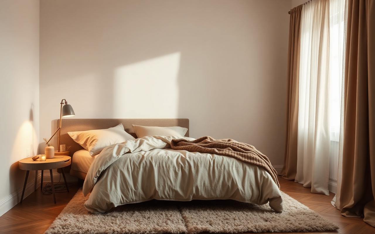
The 60-30-10 rule is a timeless interior design proportion framework: 60% dominant base color (walls, large rugs), 30% secondary structural color (drapes, upholstered furniture, cabinetry), and 10% accent tone (throw pillows, artwork, ceramics).
This balance prevents spaces from feeling monotone while ensuring accent colors add interest without overpowering the room's overarching mood.
2. Evaluating Natural Light & Room Undertones
Never select paint under store lights. North-facing rooms receive cool, blue-tinted natural light throughout the day, which benefits from warm beige, cream, or terracotta undertones to avoid feeling chilly.
South-facing spaces receive warm golden light all day long, allowing cool greys, slates, and muted sage greens to look balanced, fresh, and crisp.
3. Creating Cohesive Whole-Home Flow
To avoid an erratic, choppy transition between rooms, establish a single connecting neutral paint color for hallways, trim, and ceilings throughout connected living spaces.
Vary accent colors and texture intensity from room to room while keeping floor finishes and trim molding unified.
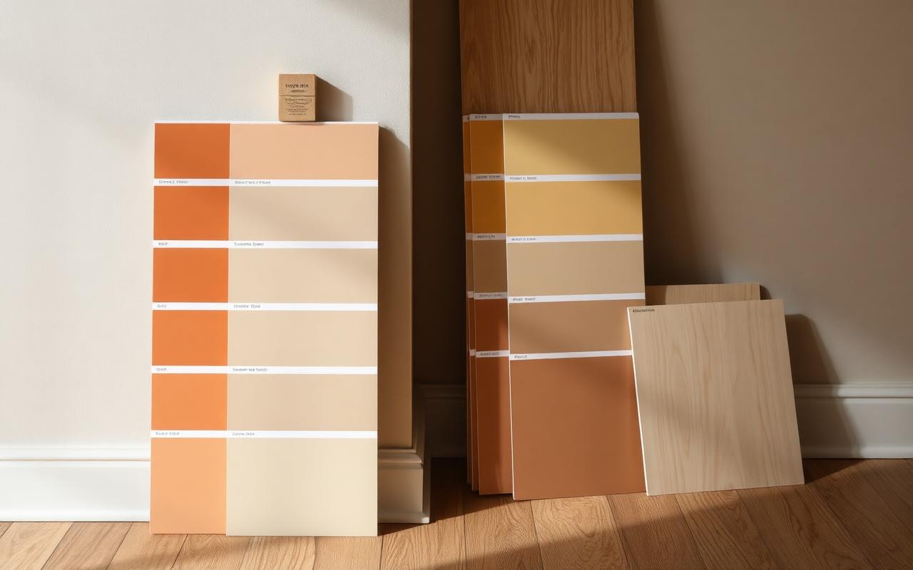
- Paint large swatch boards and move them across different walls at morning, afternoon, and night before making a final decision.
- Treat natural wood tones (oak, walnut) as neutral anchors that break up painted wall surfaces.
- Use matte or eggshell finishes on walls to soften light reflections and conceal subtle drywall imperfections.
Yes. Simply split the 10% accent ratio into two complementary shades (e.g., 5% deep amber, 5% brushed brass accents).
Light-reflective warm neutrals reflect soft light effectively without making windowless or small spaces feel stark.